A brief introduction to Data Visualization
Welcome!
Welcome to my brief introduction to Data Visualization. In this post I’m going to go over the fundamentals of datavis, starting off with a little history lesson. The fundamentals of datavis can be quite broad, so I’m going to go over the bare essentials. There’s a lot of ground to cover here, so I’m going to delve deeper into topics individually in later posts. :)
What is Data Visualization
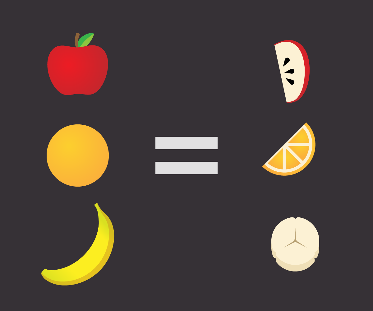
In a nutshell: data visualization turns datapoints into visual elements. By placing data in a visual context, it is easier to understand for humans. Certain trends, correlations, or other anomalies suddenly become clear because they are exposed in a visual manner that humans can now comprehend and better understand. As a data visualization guy, I make data available for a wider and bigger audience. That is my goal. Data can be visually encoded by using, among others, spatial position, color, size, shape, and length. The effectiveness depends on whether the data is categorical, ordered or quantitative (more on this later).
Human beings look for structure, features, patterns, trends, anomalies, and relationships in data. Visualization supports this by presenting data in various forms with differing interactions. A visualization can provide a qualitative overview of large and complex data sets, can summarize data, and can assist in identifying regions of interest and appropriate parameters for more focuses quantitative analysis.
Brief history of Data Visualization
We can go back quite far in history. ‘Data’ has always been around. Landmarks and animals were drawn in caves by our ancestors. An explosion of a supernova – now known as the Crab Nebula – thousands of lightyears away was drawn in 1054 AD by an early civilization in what is now New Mexico, USA. Brian Cox talks about it here (if you’re into space, the entire presentation is fascinating).
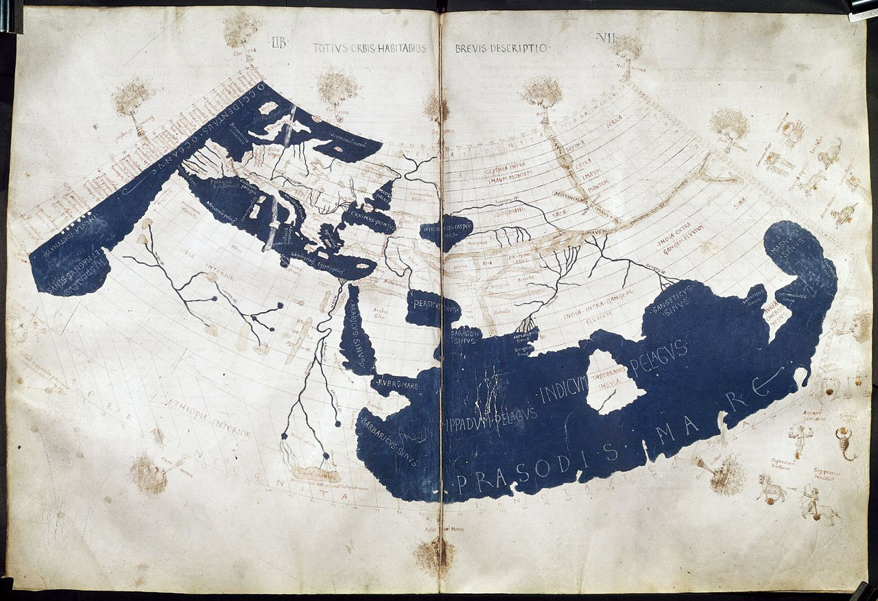 Maps were also drawn. Ptolemy’s world map comes to mind. It’s a map of the known world according to Hellenic (Greek) society in the second century. Now as time went on, these maps continued to improve. Various European powers mapped a great deal during the 18th century. Check out this article by The Guardian that visualises shipping trade routes.
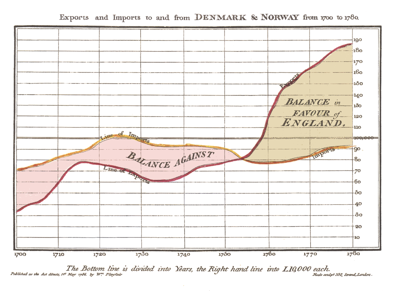 The 18th century was significant for Data Visualization. It was during this century, in 1786, that William Playfair published the first ever timeseries graph (better known as a line chart) in his Commercial and Political Atlas. This graph marked the beginning of data visualization as we know it today.
In the second half of the 20th century, French cartographer Jacques Bertin used quantitative graphs to represent information intuitively and show the extent to which it helps people carry out data analysis or communication tasks. Bertin is considered to be one of the most important figures regarding modern data visualization. Well before Edward Tufte, Bertin described the contours of his “Graphic Sign System”, an early framework for designing and evaluating data-based graphics – effectively laying the foundation for modern data visualization.
The 21st century is regarded as the information age. The volume of data on the internet and the web has already been overwhelming and is still growing at stunning pace: everyday around 2.5 quintillion bytes of data is created and it is estimated that 90% of the data today was generated in the past few years. This is what we now call “big data.” The quantity of available data is rapidly growing each day. Today, information seems almost limitless: making room for virtually endless data visualization projects.
Visual Perception
Visual perception is the ability to interpret our surroundings through the light that enters our eyes. It plays an important role in design and data visualization. It’s the core of data visualization and essentially the very first thing that designers must understand in order to create data visualizations. The visualization is visually appealing, remains true to the truth and are understandable for humans. Typically, visualizations can support three activities:
- Exploratory analysis: The user intends to discover new knowledge from the data.
- Confirmatory analysis: The user has a hypothesis and his objective is to determine evidence for the acceptance or rejection of that hypothesis.
- Presentation: This is used for graphic display and representation of the characteristics of the data.
One of the most well-known perception theories are the Gestalt Principles. According to the Gestalt Principles, the brain configures information through sensorial channels, perception and memory. The theory follows five principles for understanding graphic elements:
- Proximity: if elements are placed together, they tend to be perceived as a group, even if they are not similar.
- Similarity: if elements have similar characteristics they tend to be grouped together. This similarity occurs mostly in color, shape and texture.
- Closing: lone elements that are placed in a certain way, they seem to form a boundary and/or closed line, even if the elements are not connected to each other.
- Continuity: continuity occurs when it looks like a certain set of elements create a certain pattern or appear to build a flow along a common direction.
- Figure-ground: this occurs when two elements overlap, where the figure on top is distinguishable from the background element.
Then there’s volume and depth. Volume and depth includes different cases in which elements on a screen can be perceived has having volume and depth, without it actually being so in reality. These include: overlapping, in which two overlapping elements would show the last element as being more distant than the first element. Similarly, two elements with different size would show the biggest element as the dominant factor and therefore appear to be closer than the smaller element.
More later
I will post more later. Topics will include data analysis with R, geographic data with D3 and vanilla Javascript coding patterns.
Thanks for reading!
- Kenny